

This analysis takes inflation data from the BLS and recalculates percentage changes at the category level to obtain unrounded figures. The total number is linked to the BLS, but it gives more detail at the granular level.
April CPI
Below is inflation data taken from the BLS. After bottoming out in October last year at 0.08%, the monthly figure is now at 0.31%, which is lower than the last 3 months but still at an annualized rate of 3.7%. Even though the monthly figures were lower than expected, it is very clear that we are at a new level of persistent inflation.

Figure 1: Monthly inflation
Year-on-year CPI has been around the low 3% range since June last year, but has picked up over the past two months. This is not surprising since the monthly increase of 0.09% compared to March last year has decreased. Next month will also likely see a slight rise in the annual figure, as May 2023's 0.11% declines.

Figure 2: Year-over-year inflation
Looking at individual categories against history, it's clear that energy has an outsized effect and the housing sector remains high at 0.38%, an annualized rate of 4.7%.
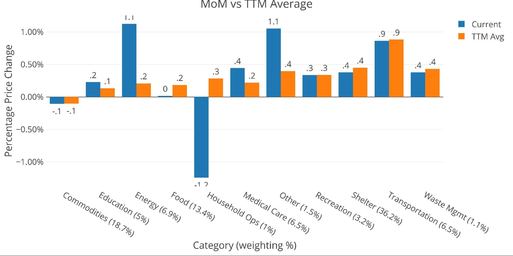
Figure 3: MoM vs. TTM
The table below gives a more detailed breakdown of the figures. It shows the actual numbers reported by the BLS side by side with the recalculated, unrounded numbers. The weighted column shows the contribution of each value to the aggregated number. Details can be found on the BLS website.

Figure 4: Detail of inflation
Looking at the Fed numbers
The Fed uses a different category methodology than the BLS, but the total number is equal. Below is the figure reported by the Fed. According to the Fed categories, 6 of 8 categories are above the 12-month trend. Apparel has seen a massive rise over the past month. Only food and housing are below the 12-month trend.

Figure 5: Current and historical
Historical perspective
Below is a much longer view of inflation and interest rates from the Fed and BLS (at the aggregate level the data is the same).

Chart 6: Fed CPI
BLS categorical data can be viewed below. Again, this doesn't look like a wave ready to drop to 3% anytime soon. This looks more like a drop before another rise.

Figure 7: Historical CPI
The data source: https://www.bls.gov/cpi/ And https://fred.stlouisfed.org/series/CPIAUCSL
Data updated: monthly within the first 10 business days
Last updated: April 2024
Interactive tables and graphs are still available on the Explore finance dashboard: https://exploringfinance.shinyapps.io/USDebt/

Call 1-888-GOLD-160 and speak with a precious metals specialist today!