
In February, data showed that Yellen made a big bet that long-term rates would not remain high for long. This was demonstrated by the volume of short-term debt issuance. The Treasury was willing to pay higher rates to keep the debt maturity shorter.
This continues to be the case. Over the past two months, the vast majority of new debt has been short-term Treasury bills (1 year or less).
Note: Nonmarketable assets include almost entirely the debt the government owes to itself (for example, debt owed to Social Security or the public pension).
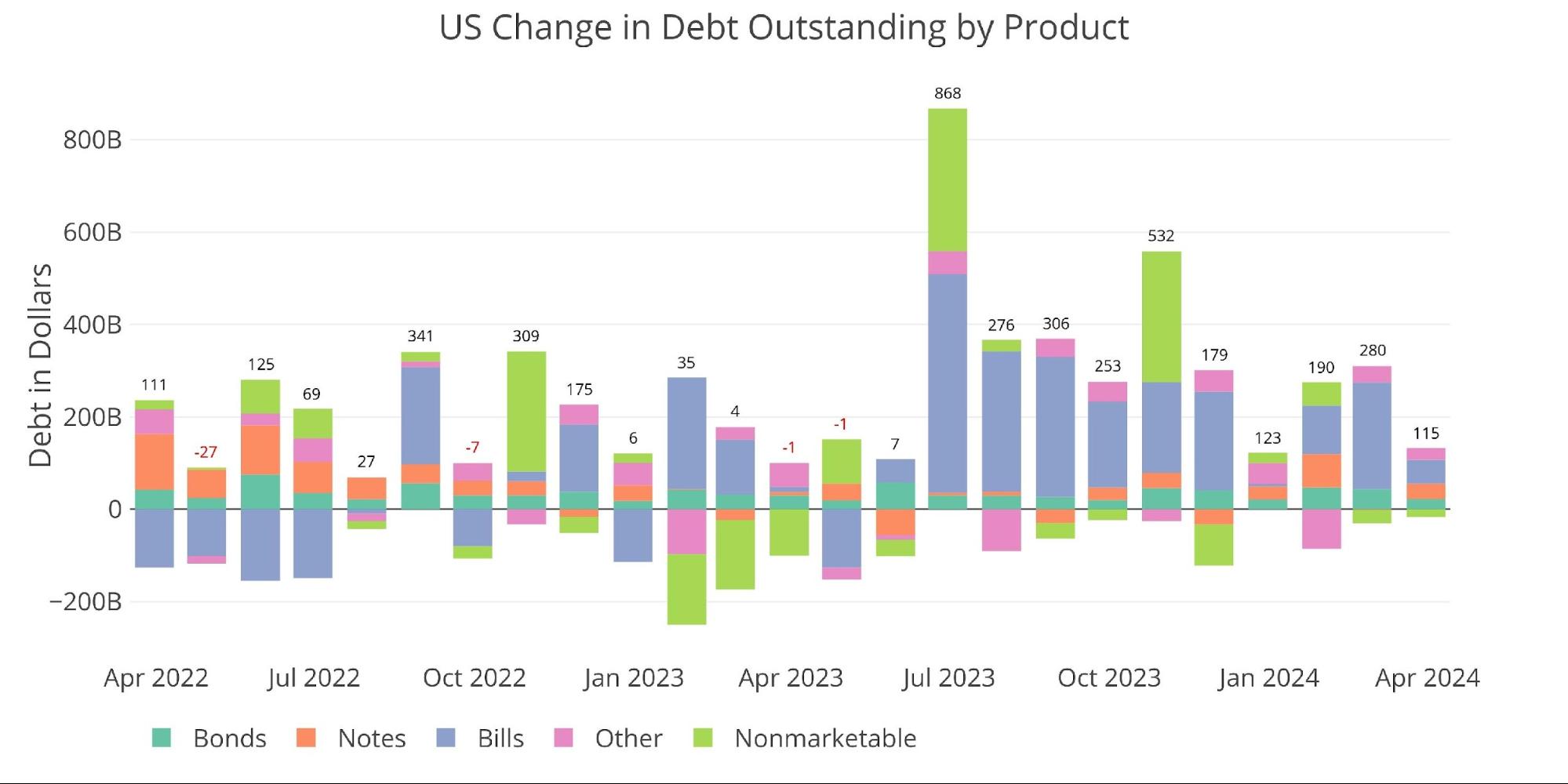
Figure: Change in debt over one month
In the first three months of 2024, the Treasury added more than $600 billion in new debt, more than half of it short-term.
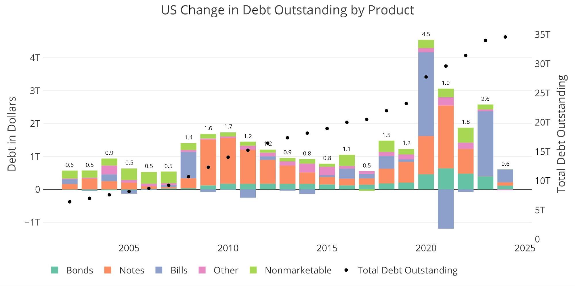
Figure: Variation in debt over 2 years
So far in 2024, the Treasury has maintained a fairly stable cash balance of $800 billion.
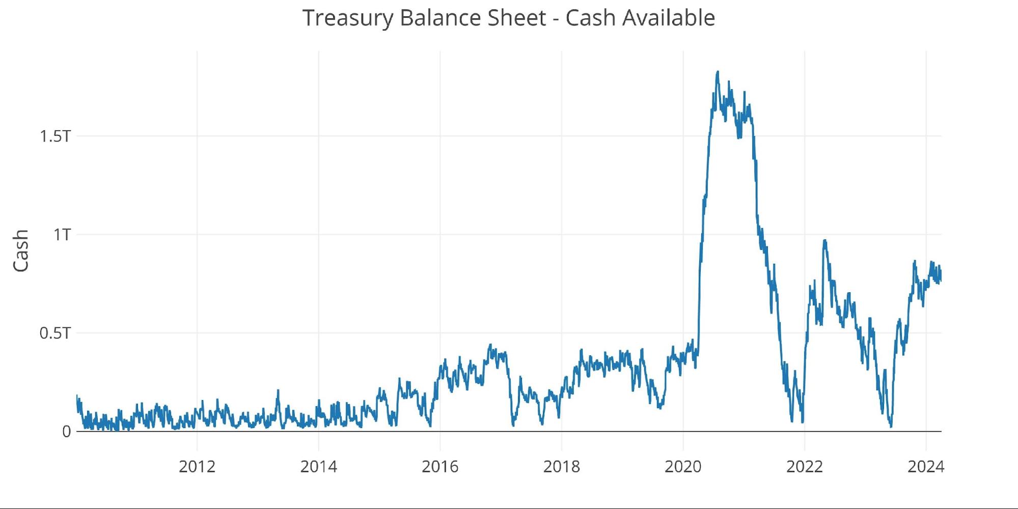
Figure: 3 Treasury cash balance
The chart below shows the true danger of current Treasury actions. The average debt interest rate increases very quickly while the average maturity decreases. The blue line shows actions aiming to issue as many securities in the short term, while the orange line shows the current situation of high interest rates. The hope is that as interest rates fall, they can reverse these two lines together. But what happens if interest rates remain high?
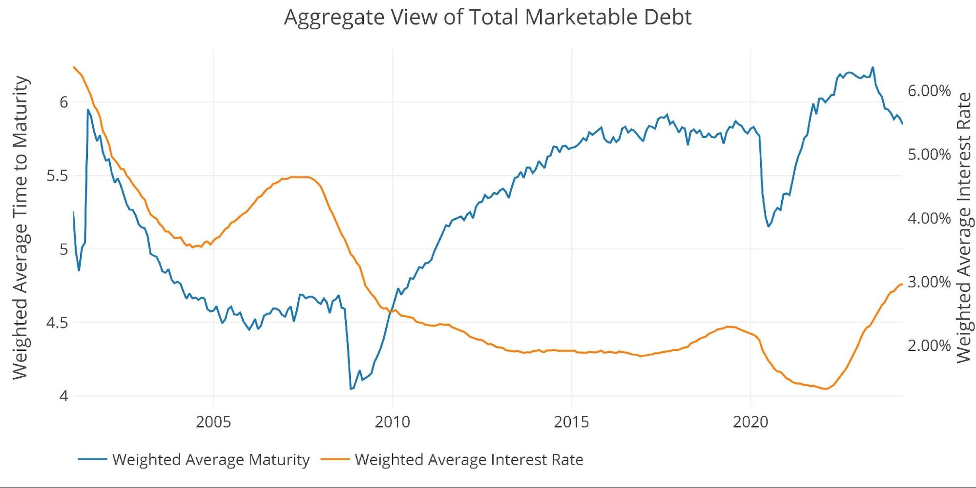
Figure: 4 weighted averages
Honestly, they can't because the Treasury simply can't afford it. Fed officials can say all they want about their reliance on data, but the chart below is the only data that matters. The interest rate trajectory is completely unsustainable.
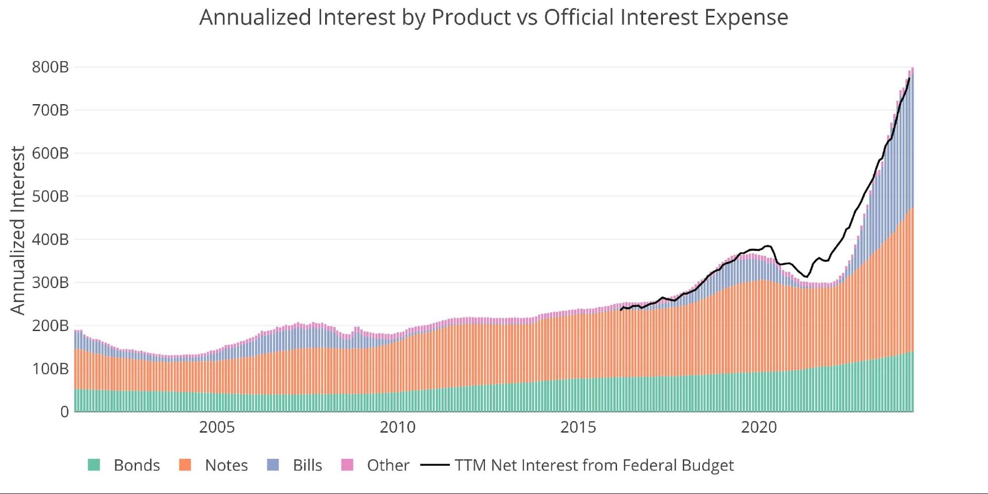
Figure: 5 Net interest expense
Using the current Fed dot chart and rolling debt maturity produces the forecast below. Once again, Treasury has left “debt affordability” in the rearview mirror in 2021. Treasury is now completely hemorrhaging cash to service the debt.
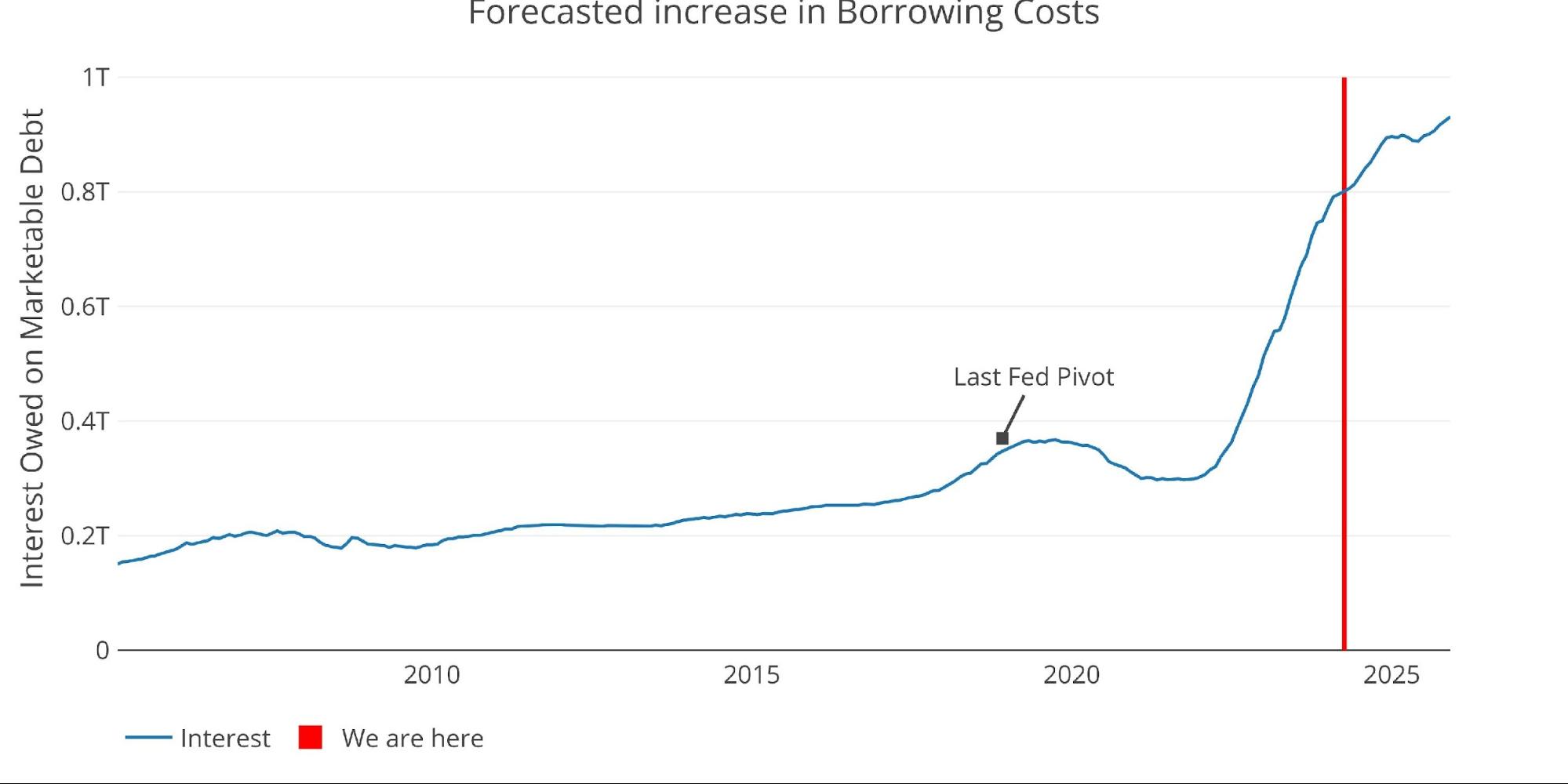
Figure 6: Projected net interest charges
Speaking of debt issuance and refinancing, the chart below shows expected debt maturing this year for maturities of 2 to 10 years. Debt refinancing will be more than $500 billion higher than it was in 2023, despite the fact that they are adding almost no new debt to the note balance.
Note The “net change in debt” corresponds to the difference between debt issued and debt matured. This means that when it is positive, it is part of the debt issued and when it is negative, it represents the debt that has matured.
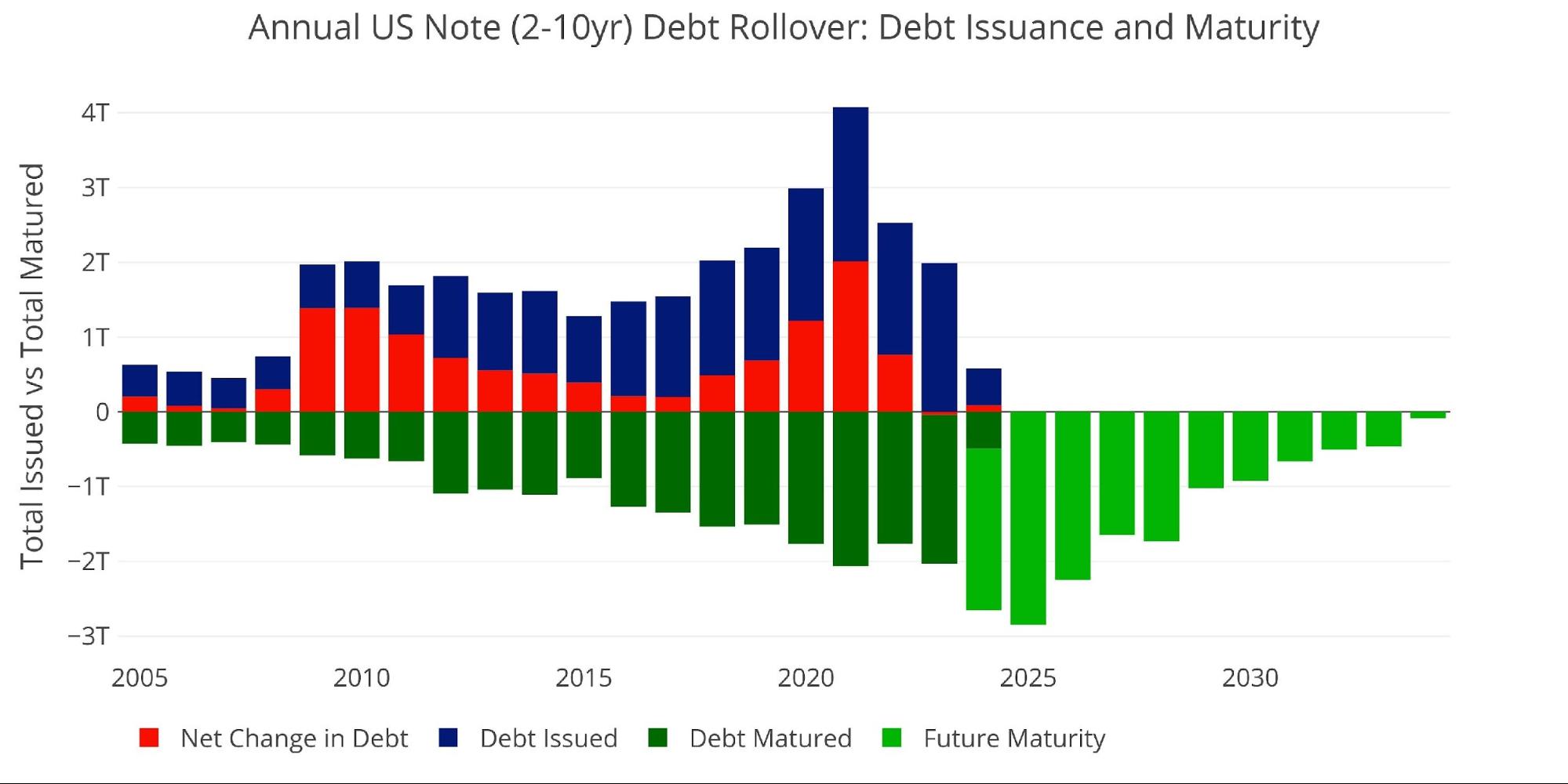
Figure: 7 Renewal of Treasury bills
Yield curve
The inverted yield curve adds even more confusion to the Treasury decision. The Treasury could now pay lower rates by issuing longer-term debt. The two problems are market saturation and debt lock-in. The market cannot absorb massive volumes of long-term Treasury debt. Yellen doesn't want to block these high rates either.
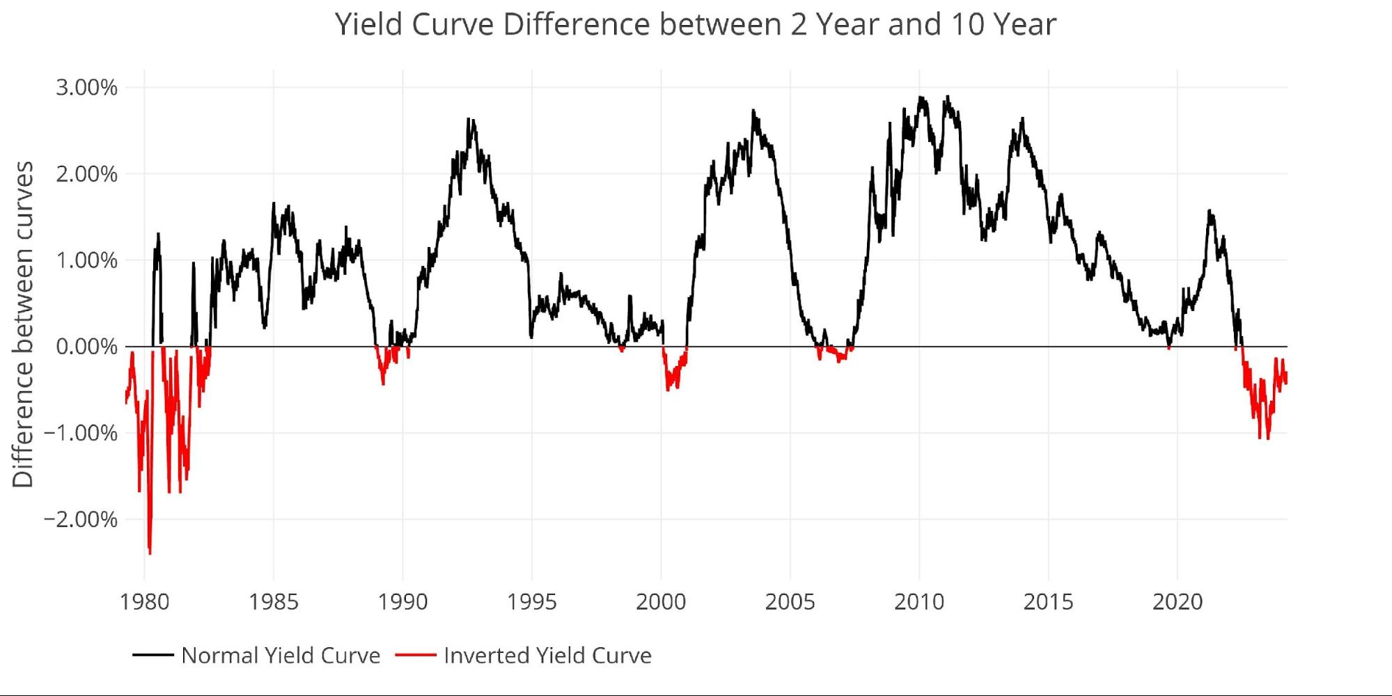
Figure: 8 Tracking the inversion of the yield curve
Historical perspective
The graph and table below show how debt and interest have changed over time.
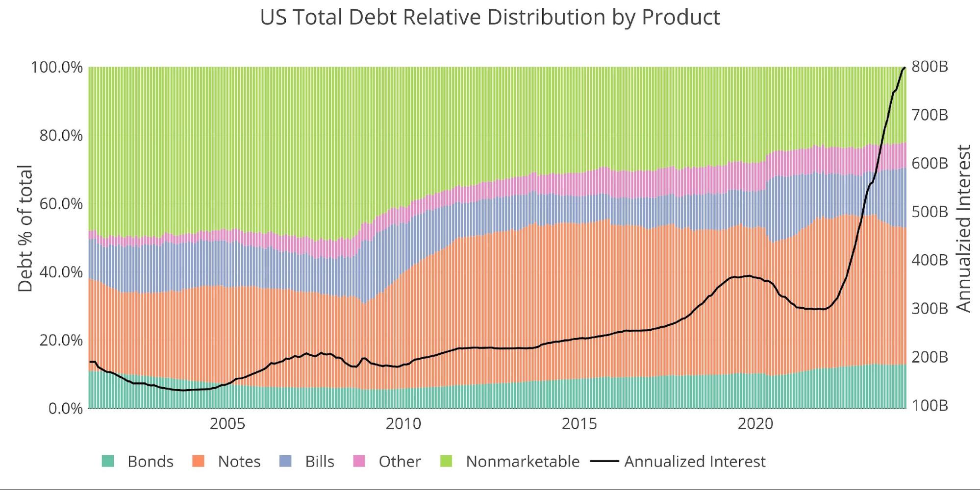
Figure: 9 Total debt outstanding
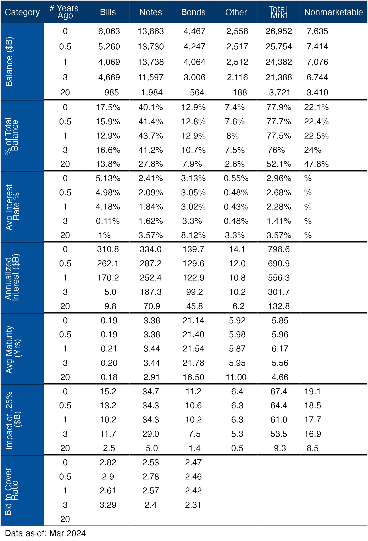
Figure: 10 details of debt over 20 years
Wrap
Many Fed officials and market experts have called the current fiscal situation “unsustainable.” That's an understatement. The current financial situation is a real disaster with no way out. People have been talking about a ticking time bomb for decades. That bomb went off and it's worse than anyone could have imagined. Anyone who sticks to the soft landing narrative and justifies this as a future problem is not doing simple math. Attach your belt !
The data source: https://www.treasurydirect.gov/govt/reports/pd/mspd/mspd.htm
Data updated: monthly on the fourth business day
Last updated: March 2024
Interactive US debt tables and charts are still available on the Explore finance dashboard: https://exploringfinance.shinyapps.io/USDebt/

Call 1-888-GOLD-160 and speak with a precious metals specialist today!